The Typographer's Legacy: Examining the Font Evolution in TV Guide Branding Over Decades
For those of us drawn to the allure of vintage memorabilia, there’s a quiet beauty in the tangible – the worn edges of a vinyl record, the subtle crackle of an antique radio. And for collectors of TV Guide, that beauty extends to more than just the programs listed within. It’s about the magazine itself, the feeling of its paper, and most subtly, but powerfully, the evolution of its typeface and branding. It’s a silent chronicle of American taste, technology, and a nation’s obsession with the flickering screen.
I remember my grandfather, a man of few words but boundless enthusiasm for the Dodgers, always had a TV Guide in his lap. It wasn't just for the listings; it was a ritual. He’s the reason I started collecting – the faint scent of aged paper and that distinctive font triggered something profound within me. It represented a simpler time, a shared experience glued to the television set with the family. And that font, that seemingly simple arrangement of letters, played a surprising role in shaping that feeling.
The Early Years: Establishing a Voice (1953-1960s)
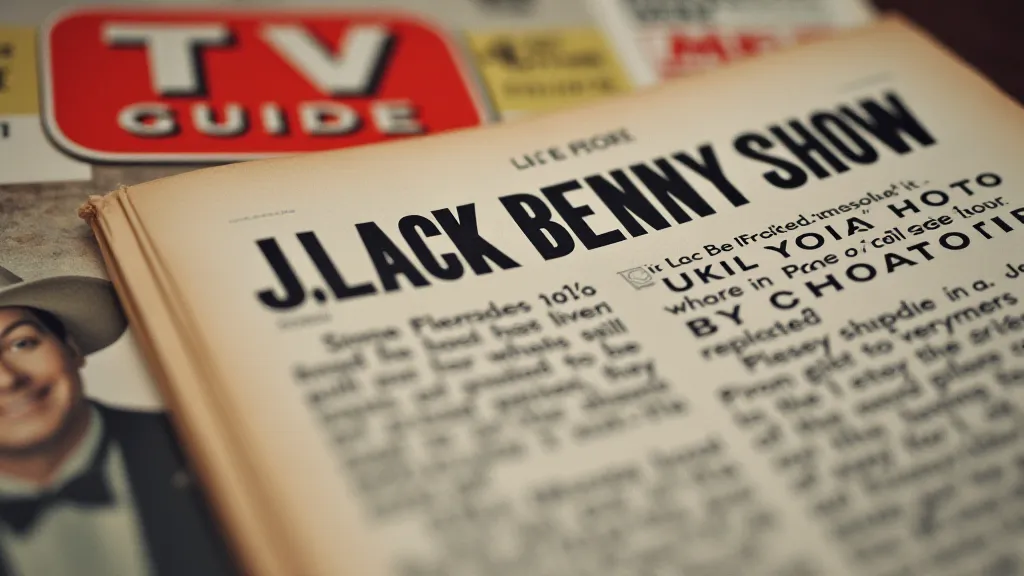
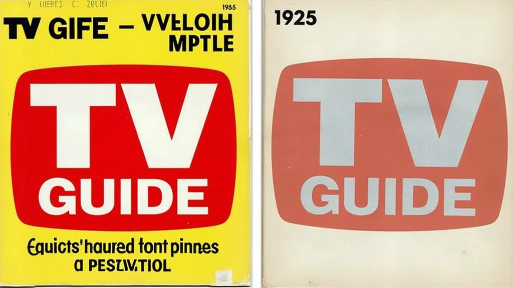
Launched in 1953, the inaugural TV Guide utilized a custom typeface, often described as a modified version of Century Gothic. It was clean, modern, and reflected the optimism of the post-war era. Think of it as the visual embodiment of the burgeoning television industry itself – fresh, innovative, and full of promise. The initial branding wasn’t particularly flashy; functionality was key. The focus was on providing clear, concise television listings, a stark contrast to the fragmented and often unreliable information available before.
The magazine’s early success was undeniable. It quickly became a household staple, and the typeface played a crucial part in establishing that familiarity and trust. It was approachable, legible, and projected an image of reliability - essential qualities for a publication meant to organize the increasingly complex world of television programming. The cultural landscape was transforming rapidly, and understanding audience trends was becoming critical for media outlets. Later analyses, as explored in "The Paper Prophets: Predicting Audience Trends Through Historic TV Guide Subscription Data, demonstrate the profound influence of demographic shifts on the magazine's trajectory.
The Swinging Sixties: Experimentation and Change
The 1960s brought seismic shifts in American culture, and TV Guide wasn’t immune. The typeface began to subtly evolve, taking on a slightly more rounded and friendly appearance. This shift reflected the burgeoning popularity of more casual and playful styles that were permeating graphic design at the time. Think of the iconic psychedelic posters and the playful typography found in advertising – TV Guide was keeping pace with the changing tides. The shift also occurred alongside powerful societal commentary being woven into the shows themselves. Collectors often delve into the shows listed within to better appreciate the broader historical context, as examined in "Beneath the Glossy Covers: Unpacking the Social Commentary in 1950s Television Programs.
The introduction of color television also influenced the design. While the primary typeface remained largely consistent, the use of color became more prominent in the logo and cover design, attracting the eye and further emphasizing the visual spectacle of television programming. The magazine began experimenting with more dynamic layouts, mirroring the evolving presentation of television itself. These changes, though seemingly minor, signaled a willingness to adapt and stay relevant within a rapidly changing media landscape. The sense of permanence that characterized the early years began to soften, replaced by a feeling of progress and adaptation.
The 1970s and Beyond: A Balancing Act
The 1970s marked a period of more significant typeface changes. The original custom font was gradually phased out, replaced by variations of Helvetica and Univers – both widely used and highly legible typefaces that embodied a sense of efficiency and modernity. While some purists lamented the loss of the unique character of the original font, the shift reflected a move towards a more streamlined and universally appealing aesthetic. The sheer volume of content available to viewers was exploding, making the magazine's curation even more vital. Many stories found within these vintage magazines offer glimpses into narratives and experiences that might otherwise be lost to time, a theme explored in "Echoes in the Bindings: Unearthing Lost Narratives Through Vintage TV Guides. These magazines serve as remarkable time capsules, revealing not only programming schedules but also the cultural values and social trends of the era. The magazine's ability to reflect and shape those trends contributed to its enduring popularity.
This era was characterized by a balancing act: maintaining a sense of brand recognition while catering to a more diverse and fragmented audience. Cable television began its ascent, offering an overwhelming number of channels and programming options. TV Guide needed a typeface that could convey information clearly and efficiently within increasingly cluttered layouts. While the distinctive "personality" of the earlier font diminished, the focus on readability and clarity intensified. Understanding how TV Guide navigated this era of media proliferation is key to appreciating its evolution – a challenge that required constant adaptation and a keen eye on shifting consumer preferences. The very act of curating such a vast array of choices became a powerful influence on the viewing habits of millions.
The Craftsmanship and the Collector's Eye
For the serious collector, these subtle typeface variations are more than just academic curiosities. They’re clues to the magazine's history, markers of an era. The early, custom-designed fonts are increasingly rare and highly sought after. Condition, of course, is paramount, but the presence of that original typeface significantly increases a TV Guide’s value. Identifying these variations takes careful observation – paying attention to the subtle curves, the letter spacing, and the overall feel of the typography. The intricate process of authentication and identifying first editions is a specialist field in itself, a fascinating pursuit that requires a deep understanding of printing techniques and historical context, as detailed in "The Curator’s Codex: A Practical Guide to Identifying First Editions and Rare TV Guides. A dedicated collector must develop a refined sense of detail to distinguish between subtle variations and accurately assess the significance of each issue.
Restoration, when appropriate, is a delicate process. The goal isn’t to “improve” the magazine, but to preserve its original character. Gentle cleaning to remove surface dust and careful storage in acid-free sleeves are the standard practices. Attempting to alter the typeface would be considered sacrilege within the collecting community.
A Legacy Etched in Ink
The evolution of the TV Guide typeface mirrors the evolution of American culture and the television industry itself. It’s a silent testament to the relentless march of technology and the ever-changing tastes of consumers. While the original font may be gone, its legacy lives on in the memories of those who grew up with TV Guide in their hands. And for collectors like myself, it serves as a constant reminder of a time when television was a shared experience, and a simple font could evoke a profound sense of nostalgia. The quiet elegance of the typography represents more than just a font; it’s a window into a bygone era, beautifully preserved in the pages of a vintage magazine.
The magazine's influence extended far beyond its listings, acting as a cultural touchstone and reflecting the evolving tastes and priorities of American society. The stories and imagery within its pages offer a fascinating glimpse into the past, allowing us to connect with a time when television was a relatively new and transformative medium. The hunt for rare and early issues is a testament to the enduring fascination with this iconic publication. The careful preservation of these issues allows future generations to connect with a pivotal moment in American cultural history.
The increasing scarcity of early TV Guide issues has created a burgeoning market for collectors, who appreciate not only the informational value of the magazine but also its aesthetic and historical significance. The price of these collectible items is directly related to their condition, rarity, and the desirability of the specific edition. Understanding the factors that influence the value of vintage TV Guide issues is essential for both collectors and those interested in the broader market dynamics, as discussed in "The Price of Nostalgia: A Collector’s Perspective on the Fluctuating Market for Vintage TV Guides.
Ultimately, the story of TV Guide is more than just the story of a magazine. It's a reflection of a nation's evolving relationship with media, entertainment, and the very idea of leisure. Its pages hold not only schedules and reviews but also a rich tapestry of cultural history, and for dedicated collectors, the pursuit of these treasures is a journey into a fascinating era of American life.