The Art of the Grid: Deconstructing the Layout and Design of 1960s TV Listings
There's a peculiar intimacy that settles over you when you hold a vintage TV Guide. It’s more than just paper and ink; it's a portal to a bygone era, a snapshot of collective cultural consciousness. For those of us drawn to collecting these relics, it’s often the design – the iconic grid – that provides the initial allure. But beyond the nostalgic appeal lies a meticulously crafted structure, a system of visual communication that was revolutionary for its time and holds surprising insights into how we, as a nation, consumed entertainment.
My own fascination began unexpectedly. My grandmother, a woman of quiet routines and impeccable taste, kept a trove of old TV Guides carefully stacked in her attic. As a child, I'd pore over them, mesmerized by the black and white photos of actors I only knew from grainy reruns and the dense columns of listings. I didn’t understand the cultural weight they held then, the sheer volume of information they conveyed. I just loved the ordered chaos of the grids, the promise of evenings filled with fantastical stories and escapism.
The Evolution of the Grid: From Chaos to Clarity
The earliest TV Guides, born in the 1950s, were, frankly, a mess. Trying to organize the fledgling medium’s inconsistent schedules and often-changing program formats was a significant challenge. Listings were crammed together, often lacking clear formatting or consistent presentation. They resembled more a frantic scramble than a carefully curated guide. The rapid growth of television – the sheer explosion of new shows and networks – demanded a better system. Enter the grid as we recognize it.
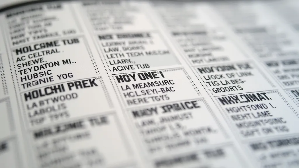
The 1960s saw the refinement of this system. It wasn't just about listing programs; it was about making them accessible. The grids became more standardized, with clearer time slots, network logos, and concise program descriptions. The use of boldface type to highlight popular shows or special events became prevalent, adding a layer of visual hierarchy. This wasn’t arbitrary; it was a deliberate effort to guide the viewer's eye, to prioritize information based on perceived importance. The design team at TV Guide understood that information overload was a real threat, and they sought to mitigate it through intelligent visual cues.
The Craftsmanship of Information
It's easy to take for granted the simple act of reading a TV Guide. But consider the labor involved. These weren’t just randomly compiled lists. There were researchers verifying schedules, copywriters crafting succinct descriptions, art directors designing the layout, and printers executing the final product. The level of detail was astonishing. Imagine the sheer volume of correspondence with network representatives to confirm program timings, a task that would be immensely tedious even with modern technology. The process itself speaks to a dedication to accuracy and a profound respect for the viewer’s time – a value that’s perhaps diminished in our era of instant, often unreliable, online information.
The typography itself deserves consideration. The choice of fonts, the spacing between lines, the careful selection of font sizes – all contributed to the overall readability and aesthetic appeal. The consistency in these elements throughout the decade fostered a sense of familiarity and trust. It wasn’t just about informing viewers; it was about creating an experience, a ritual. The feel of the paper itself, the faint scent of aging ink – these sensory details further enhanced the connection to a simpler time. The very creation and curation of these publications represent a fascinating slice of media history, a period where precision and a commitment to shared experience were paramount. To truly understand the importance of these objects, one might delve into echoes in the bindings, uncovering lost narratives through vintage TV Guides.
Beyond the Listings: The Art of the Cover
While the interior grid was the functional heart of the TV Guide, the cover was its artistic soul. The covers of the 1960s were iconic, featuring larger-than-life portraits of celebrities, often in dramatic poses or promotional stills from their shows. These images weren’t just meant to sell copies; they were designed to capture the zeitgeist, to reflect the cultural landscape of the moment. They became instant collectibles in their own right, highly sought after by enthusiasts. The composition, lighting, and cropping of these photographs were carefully considered to create maximum impact – a miniature piece of fine art. Think of Lucille Ball's beaming smile, or the stoic gaze of a leading man – each cover offered a glimpse into the celebrity culture of the time.
The Impact on Consumption
The standardized layout of the TV Guide fundamentally altered how television was consumed. Before its ubiquity, families relied on word-of-mouth or local newspapers for television schedules – information that was often unreliable and incomplete. The TV Guide provided a single, authoritative source, empowering viewers to plan their evenings and make informed choices. It fostered a sense of shared experience, as families gathered around to pore over the listings and decide what to watch together. It also created a sense of anticipation – the excitement of looking forward to a particular show, knowing exactly when and where to tune in. The responsibility of preserving these tangible pieces of television history falls on the shoulders of collectors, who work to maintain and understand these vital archives. Exploring the ephemeral archive sheds light on the dedication required to preserve this history.

Restoration & Identification: A Collector’s Perspective
For those of us who collect vintage TV Guides, preserving these artifacts is a labor of love. Proper storage is paramount. Protecting them from direct sunlight, humidity, and pests is crucial to prevent deterioration. Gentle cleaning with archival-quality materials can remove surface dust and grime. However, avoid aggressive cleaning methods that could damage the paper. The meticulous attention to detail involved in creating these publications is mirrored in the dedication collectors show to preserving them.
Identifying the specific year and issue of a TV Guide can be surprisingly complex. While the date is usually printed on the cover, variations in cover design, regional editions, and printing errors can make accurate identification challenging. Resources like the TV Guide Collectors Association website offer detailed reference guides and expert assistance. The subtle nuances in typeface, layout, and cover imagery can provide valuable clues to help pinpoint the precise issue. Beyond the schedules themselves, there’s a wealth of stories embedded within the advertisements, offering a unique window into the consumer culture of the era. A closer look at a catalog of moments reveals the untold stories within those fleeting appearances in TV Guide ads.
The People Behind the Publication
It's easy to focus on the glossy covers and the meticulously organized listings, but the creation of a TV Guide was a monumental collaborative effort. From the researchers who meticulously tracked ever-changing schedules, to the copywriters who distilled complex plots into concise descriptions, and the art directors who crafted the iconic layouts, each individual played a vital role. And let’s not forget the printers, who translated those designs into tangible reality. The entire process relied on complex coordination, a stark contrast to the often-fragmented workflows of modern digital media production. Understanding the scope of this endeavor truly elevates the appreciation for the printed TV Guide.
The Enduring Legacy
The TV Guide may no longer hold the same cultural dominance it once did, supplanted by the fragmented landscape of streaming services and on-demand entertainment. But its legacy endures. It represents a pivotal moment in media history, a time when television was a unifying force and a shared cultural experience. The meticulous craftsmanship of its design, the enduring appeal of its cover imagery, and the fundamental impact it had on how we consumed entertainment – these are all reasons why vintage TV Guides continue to captivate collectors and enthusiasts alike. Examining the inner workings of this publication and the individuals who brought it to life provides a fascinating glimpse into an era defined by shared experiences and a commitment to accuracy. Further understanding the process and the people involved enhances the appreciation for these enduring artifacts. Ultimately, the true value lies not just in the information they contained, but in the stories they represent – stories of a nation captivated by the flickering glow of the television screen. Exploring beyond the schedules reveals the untold stories of the people behind the TV Guide.