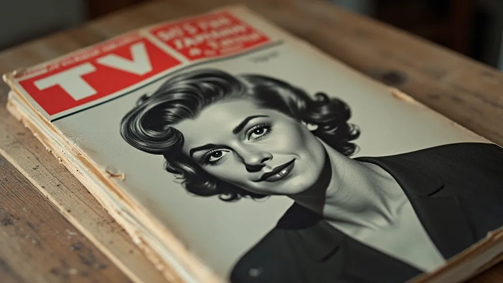
Chromatic Ghosts: The Evolution of Color and Advertising in 1960s TV Guides
There's a peculiar magic in holding a vintage TV Guide. Not just the slick, tactile feel of the paper – often a little worn, a little brittle, a whisper of another era – but the feeling of holding a portal. A portal to a time when television was a shared experience, a town square of flickering images and communal laughter. My own fascination began with my grandfather's collection, a chaotic pile rescued from attic storage, each issue a snapshot of a specific week in the 1960s. While the programs themselves are captivating, it's the subtle shifts in the TV Guide’s presentation – particularly the introduction of color – that offer a fascinating lens through which to view the changing landscape of American culture and advertising.
Before the 1960s, the TV Guide was a largely black and white affair. A monochrome reflection of a world still largely in grayscale. Initially, the magazine simply listed programs, providing episode descriptions and times. It was purely functional, a utilitarian guide to the burgeoning television landscape. Think of the early televisions themselves – bulky, expensive, and producing a small, flickering picture. Television was a novelty, something to be experienced together in living rooms, a centerpiece of family time. The TV Guide, in its simplicity, mirrored that experience.
The Dawn of Color: A Gradual Transition
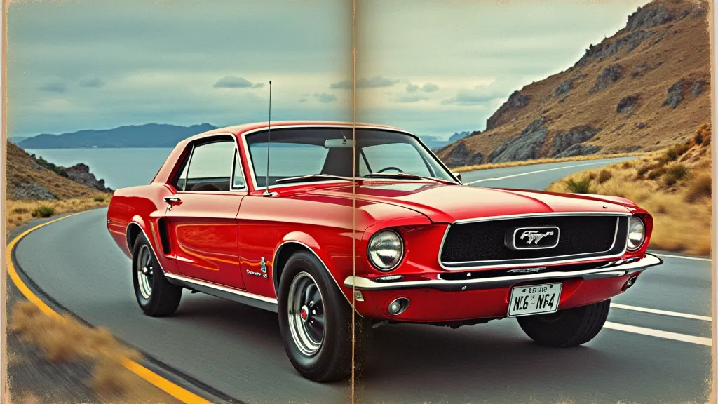
The shift to color television wasn't immediate, of course. It was a slow, protracted process, a gradual seepage of vibrant hues into the established black and white world. And the TV Guide, ever the documentarian, faithfully recorded this transformation. The initial foray into color was cautious. Starting in 1963, TV Guide began incorporating color advertising, typically for products like automobiles and appliances – items that naturally benefited from showcasing their appearance. These early color ads were often relegated to the back pages, testaments to the ongoing technical and economic challenges. Producing a full-color magazine was significantly more expensive.
The biggest hurdle wasn’s just the printing costs; it was the consumer adoption of color televisions. Broadcasters were hesitant to produce color programming, knowing that a significant portion of the viewing audience still had black and white sets. Advertisers, too, were wary, not wanting to waste money on color ads that would only appear as grayscale for many viewers. It was a complex interplay of technology, economics, and consumer behavior.
Color Listings: A Symbol of Progress and Luxury
The introduction of color programming listings was an even slower burn. The first attempts, appearing sporadically throughout 1965 and 1966, were marked by a simple “C” placed next to a program’s title, indicating that it would be shown in color. It was a tiny notation, easily overlooked, but profoundly significant. It signified progress, a move towards a more visually rich and immersive television experience. These color listings weren’t universal; only programs actually broadcast in color received the designation.
Think about the feeling of seeing that first “C” next to The Danny Kaye Show or Bonanza. It wasn’t just about the colors themselves; it was about the implication – that you, the viewer, were part of a select group, possessing the technology to experience television at its most advanced. Color television, initially, was a luxury, a status symbol. The TV Guide, with its color notations, tacitly acknowledged that reality.
Advertising’s Evolving Palette
The gradual adoption of color profoundly impacted advertising strategies. Early black and white ads were often driven by text and stark imagery. They relied on strong copy and compelling storytelling to capture the viewer’s attention. With the arrival of color, however, advertisers gained a new weapon in their arsenal: visual appeal. Suddenly, the sleek curves of a Cadillac, the vibrant hues of a new fabric, the deliciousness of a brightly colored food product – all could be showcased with unprecedented clarity and impact. The copy became secondary; the visuals took center stage.
Analyzing these early color ads is a fascinating exercise in observing the evolution of marketing techniques. You see a shift away from the utilitarian, towards a focus on aspiration and lifestyle. Automobile ads showcased not just the car itself, but the lifestyle it represented: freedom, adventure, and social standing. Food ads emphasized not just the taste, but the visual appeal – the bright, glistening surfaces, the artful arrangement of ingredients. It was a visual feast, designed to stimulate not just the appetite, but the desire to emulate a certain ideal.
Craftsmanship and Preservation
Collecting vintage TV Guides isn't just about acquiring physical objects; it’s about preserving a piece of cultural history. Many of these magazines are fragile, susceptible to damage from sunlight, moisture, and age. Proper storage is paramount. Storing them in acid-free sleeves and boxes is crucial to preventing further deterioration.
Restoration, in the truest sense of the word, is often discouraged. The beauty of these magazines lies in their imperfections, the wear and tear that tell a story of their journey through time. However, careful cleaning with archival-quality materials can help to stabilize the paper and prevent further degradation. Learning about paper conservation techniques can be surprisingly rewarding.
More Than Just Listings
Beyond the program listings and advertisements, the 1960s TV Guide offers a remarkable window into the social and political climate of the era. Editorials and articles addressed pressing issues – the Civil Rights Movement, the Vietnam War, the space race – offering a perspective on the concerns and anxieties of the time. Even the television show reviews themselves provide a fascinating insight into the critical lens through which programming was viewed.
Holding one of these magazines is like holding a time capsule, a tangible link to a bygone era. The gradual introduction of color, both in the advertising and the program listings, wasn’t just a technical advancement; it was a reflection of a nation undergoing a profound transformation. It's a story told in shades of grayscale transitioning to vibrant hues, a captivating reminder of the ever-evolving relationship between television, advertising, and the American experience.